The generation of these insights is what truly gives data it’s value as it is these insights which drive your decision-making process. As such, it is critical to put your data in the hands of the key decision makers in a form that they can derive these insights from easily and intuitively.
Data visualisation software creates visual, engaging, and informative dashboards and reports that are the perfect solution to help achieve this.
Phoenix assists organisation to licence, design, implement, optimise, and rollout dashboards and reports while providing both technical and end-user training and support.
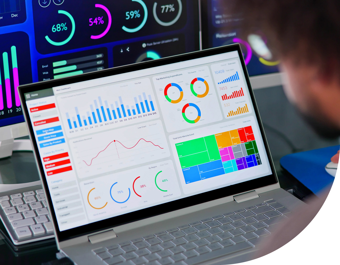

Power BI as the go-to data visualisation software
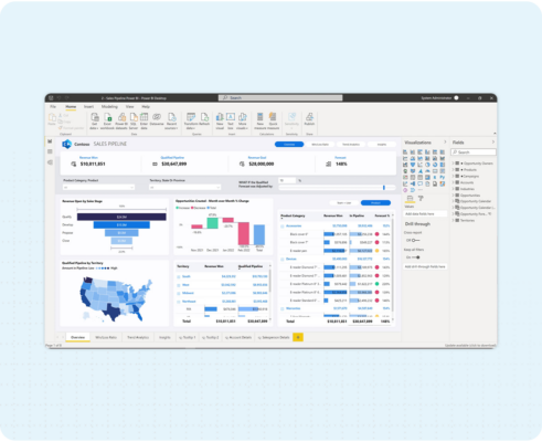
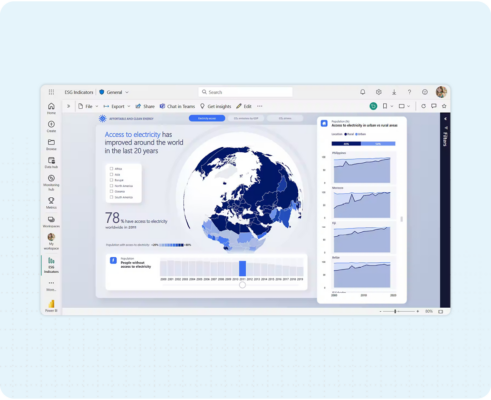
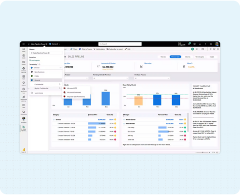
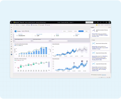
Microsoft Power BI is a data visualisation software that enables organisations to gather large quantities of data and visualise it in a way that’s easy to understand and drives actionable insights.
Power BI enables you to connect your disparate data sources to one environment and provide you with a single source for all your data. By combining both self-service and enterprise-scale BI, you’ll generate insights and innovation across all aspects of your organisation. By leveraging Power BI, you’ll benefit from:
Leverage pre-designed dashboards and report templates or build your own using drag and drop graphs and visualisations.
The free data connectors within Power BI enables you to connect to your data sources and visualise it in real time.
Utilise Microsoft’s advanced algorithms and natural language querying to swiftly query your data and automatically produce visual representations.
Visualise your data across any device, empowering your end-users to work remotely, flexibly, and efficiently.




Your data visualisation partner
Phoenix is a Solutions Partner for Microsoft Cloud, Microsoft 2021 UK Partner of the Year and holds 11 specialisations, including Modern Work, Data and AI, Digital and App Innovation, and Business Applications.
We work with our customers to plan, design, build, and support with their data visualisation projects. Our team of Data Specialists hold vast amounts of experience working with Microsoft Power BI and providing customers with intuitive dashboards and reports that’ll generate actionable insights and promote growth.


Data visualisation software FAQs
Data visualisation transforms complex datasets into visual representations, such as charts, graphs, and dashboards. This makes your large sets of data easier to understand and interpret and allows for faster insights generation and implementation of decisions.
Data visualisation is the graphical representation of data using charts, graphs, maps, and other visual elements. It translates complex datasets into easily understandable visuals, allowing users to identify patterns, trends, and relationships.
